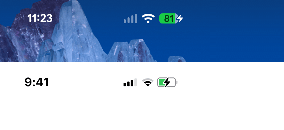
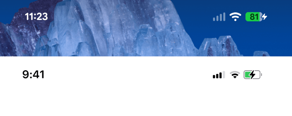
After receiving the Android 16 update containing the new Material 3 Expressive widgets on my Pixel 8a last week I immediately noticed some striking similarities to the iOS design language. Notably, the bolder, more bubbly text makes the Android status bar look almost indistinguishable from its Apple equivalent. Can you tell which is which below?
The Material 3 Expressive documentation points to increased “playfulness” and catering to people of all ages as drivers behind the new designs, which explains why it ends up looking less serious and more fun. I don’t dislike the update but I always liked the way Material 3 made Android devices look and feel different to iOS.
I’m sure I’ll get used to it but at the moment I can’t help but feel like I’m using an iPhone.
